
March 9, 2026
⯀
14
min


Your app screenshots are your app's first impression. Users form opinions in as little as 17 milliseconds, and nearly 90% of users don’t scroll past the first three screenshots. Optimizing these images can boost downloads by 20% to 35% and even improve your app store optimization, thanks to Apple indexing screenshot text since June 2025. Here’s the key to creating screenshots that drive results:
Your screenshots aren't just visuals - they’re tools to grab attention, communicate value, and convert users into downloads. With the right strategy and design, they can make a measurable difference in your app's success.

iOS vs Android App Screenshot Requirements Comparison
When designing app store screenshots, it's crucial to follow the technical requirements for file size, dimensions, and content. Apple and Google enforce strict guidelines, and failing to meet them can lead to rejection or poorly displayed images on various devices.
For iOS, upload screenshots for the 6.9-inch iPhone (1320 x 2868 px) and the 13-inch iPad Pro (2064 x 2752 px). The App Store automatically scales these images for other devices. You can include between 1 and 10 screenshots per device type.
Google Play offers more flexibility but requires manual setup. You need at least 2 screenshots and can upload up to 8 per device type (e.g., phone or tablet). Dimensions must fall between 320 and 3,840 pixels, with 1080 x 2340 pixels recommended for phones.
| Specification | Apple App Store (iOS) | Google Play Store (Android) |
|---|---|---|
| Primary Phone Size | 1320 x 2868 px (6.9" Display) | 1080 x 2340 px (Recommended) |
| Primary Tablet Size | 2064 x 2752 px (13" Display) | 1920 x 1080 px (Recommended) |
| Screenshot Count | 1–10 per device | 2–8 per device type |
| Max File Size | 10 MB | 8 MB |
| File Format | PNG or JPEG (No transparency) | PNG or JPEG (No transparency) |
Both platforms require screenshots in the RGB color space and prohibit transparency. For the best results, use PNG files and flatten them before uploading to ensure clarity in text and UI elements.
Meeting the compliance rules for Apple and Google is just as important as getting the technical specifications right.
Apple requires screenshots to accurately display the app's user interface. Using conceptual designs, images of people holding devices, or promotional graphics that misrepresent the app is not allowed. Pricing labels like "Free" or "$0.99", competitor comparisons, and fake status bars are also prohibited. For a professional touch, Apple recommends showing a status bar with full Wi-Fi, full battery, and the time set to 9:41 AM.
"Apple's most fundamental screenshot rule is simple: screenshots must accurately represent the app." - App Store Screenshot Guidelines 2026
Google Play allows more creative freedom. You can include lifestyle images, promotional graphics, and artistic compositions alongside actual UI screenshots. However, both platforms restrict unverified claims like "#1 App" or "Best" unless they reference official awards. For iOS devices, avoid placing important text or UI elements near the corners or the Dynamic Island area to prevent clipping.
When it comes to app store screenshots, think of them as more than just static images - they’re your chance to tell a compelling story that converts browsers into users. The key is to plan your screenshot strategy before diving into design. One of the most common mistakes developers make is treating screenshots as random feature showcases instead of crafting a structured narrative. To avoid this, use the Value-Flow-Trust framework. This approach helps answer three critical questions in order: "Why does this matter?", "How does it work?", and "Why should I trust you?" It mirrors how users naturally process information while browsing the app store.
Start by zeroing in on what your users care about most: the transformation your app brings. Avoid wasting prime visual space on technical screens like login pages or settings menus. Instead, focus on outcomes that solve their immediate problems. For example, instead of showcasing "Encrypted cloud sync" as a feature, reframe it as "Your data, safe and accessible anywhere." This speaks directly to what users value - security and convenience.
Pinpoint your app’s "aha" moment - that one screen that perfectly encapsulates the value your app delivers. This should take center stage in your first screenshot, as it sets the tone for the entire narrative. Understanding this user-focused perspective is the foundation for creating screenshots that resonate.
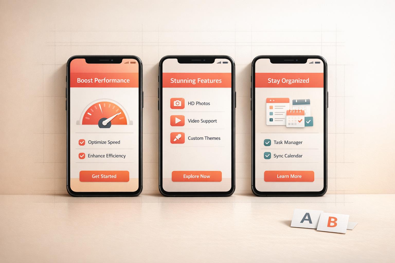
Think of your screenshot gallery as a mini-storyline with a clear beginning, middle, and end. Before designing, write captions for 5–7 screenshots and read them in sequence. Does the story flow naturally? If not, tweak the structure. A Problem-Solution-Outcome framework works well:
Instead of showing a blank dashboard, present completed actions like a finalized sleep report or a 5k tracker result. This helps users visualize themselves achieving their goals with your app. A clear narrative ensures your screenshots aren’t just visually appealing - they’re persuasive.
Most users won’t look beyond the third screenshot. On iOS, these first three images appear in search results before someone even clicks on your product page. This makes them your most critical real estate. With users deciding whether to download an app in under 7 seconds, your opening trio must deliver a complete, engaging mini-narrative.
Keep headlines concise - between 3–7 words - and action-oriented. Use verbs like "Master", "Create", or "Discover" to highlight benefits. Also, ensure your screenshots are legible at thumbnail size to grab attention even in a quick scroll.
"Your first screenshot is the headline. It must stop the scroll. The biggest mistake developers make here is showing a login screen or a complex dashboard." - AppScreenshotStudio
When it comes to app screenshots, the goal is simple: grab attention and communicate value instantly. By combining thoughtful design choices with a clear narrative, you can transform your screenshots into visuals that not only stand out but also resonate with your audience. Every detail - whether it’s typography, color contrast, or layout - plays a role in ensuring your screenshots stop the scroll and spark interest.
The golden rule here? Keep it simple. Each screenshot should focus on one idea. Trying to cram multiple features into a single image can overwhelm viewers and muddle your message. Instead, dedicate each screenshot to showcasing a specific feature or benefit, giving it the space it needs to shine. A clear visual hierarchy - headline first, then UI context, followed by the background - guides the viewer’s eye naturally and ensures they absorb your message in the intended order.
For captions, stick with color combinations that ensure readability, like white text on a vibrant, dark background. This way, even at thumbnail size, your text remains legible.
"Readability is King: text needs to be easily readable, even as a tiny thumbnail. Squinting = lost download"
Use clean, sans-serif fonts like Roboto, Montserrat, or Helvetica for maximum clarity. Headlines should be short and impactful (3–7 words), focusing on user benefits instead of technical jargon. For example, instead of "Advanced Task Manager", try "Stay Organized Effortlessly."
To add professionalism, place your app UI within a modern device mockup, like an iPhone 16 Pro. Populate the screens with real data and active states - avoid leaving blank spaces or placeholder text. For balanced and visually appealing compositions, apply the rule of thirds by dividing the screenshot into a 3x3 grid and placing key elements at the intersections.
| Design Element | Best Practice for Clarity | Common Mistake to Avoid |
|---|---|---|
| Text Length | 3–7 words per headline | Long paragraphs or technical jargon |
| Font Choice | Clean sans-serif (e.g., Roboto) | Overly decorative or mixed fonts |
| UI Content | Real, populated data and active states | Empty screens or placeholders |
| Contrast | High contrast (e.g., light text on dark) | Low-contrast text |
| Orientation | Matches app usage (Portrait/Landscape) | Mismatched orientations |
Once your screenshots are clear and readable, take them to the next level with overlays and callouts. These elements add context and turn a static interface into a compelling narrative. Text overlays, for example, can highlight benefits in a way the UI alone can’t. Instead of labeling a screen "Task Manager", use a benefit-driven caption like "Organize Your Life". This approach not only appeals to users but also improves search relevance.
"Your screenshot captions are now dual purpose assets. They have to sell the benefit to the user while simultaneously signaling relevance to the App Store's search algorithm"
Visual indicators like arrows, highlights, and annotations can draw attention to specific buttons or features within your UI. These callouts are particularly effective for platforms like Google Play, where layouts are often more feature-heavy. Position your text at the top of the screenshot to ensure it’s visible in search results, even before users click on your listing. Start captions with action verbs such as "Create", "Discover", or "Track" to emphasize immediate value.
Consistency across your screenshots is key to building trust and creating a polished, professional impression. Inconsistent branding - like mixing fonts, colors, or device frames - can make your app listing feel chaotic and unreliable.
"Using a jumble of different fonts, colors, and layouts across your gallery looks messy. It erodes trust"
To avoid this, create a master template that standardizes your brand colors, logo placement, headline fonts, and device frames across all screenshots. Stick to 2–3 primary colors to maintain a clean and cohesive look. Make sure your screenshots match the color palette and style of your app icon, so users experience a seamless transition when they tap on your app. This consistency not only enhances brand recognition but also helps communicate your app’s story more effectively.
A cohesive design approach can significantly impact your app’s success. In fact, well-designed and consistent screenshots have been shown to increase conversion rates by 20% to 35%. Paying attention to these details is a small investment for a potentially big payoff.
Designing compelling screenshots is only part of the equation. To see real results, you need to test them with actual users. Testing bridges the gap between creativity and measurable conversion gains. A/B testing, in particular, is an effective way to identify which designs resonate most with users by comparing different versions in real-world conditions.
When running A/B tests, it’s crucial to focus on one variable at a time. Testing multiple changes - like background color, caption text, and device frames - at once makes it nearly impossible to figure out which adjustment is driving results . Start with the first three screenshots, as they’re the most critical for grabbing attention. In fact, about 50% of users leave a product page within three seconds if the visuals don’t engage them.
Key elements to test include orientation (portrait vs. landscape), background colors, font styles, and captions. For instance, compare benefit-driven captions like "Start in Seconds" against feature labels like "Login Page" to see which resonates better. It’s also worth noting that iOS users often respond to lifestyle-focused imagery, while Android users may prefer visuals that highlight functionality .
"A/B testing is a way of eliminating the guesswork by trying different versions in the 'wild' for a short period of time to see which works best and then using the winner long-term." - Ariel, Appfigures
Run your tests for 7–14 days to capture both weekday and weekend user behavior . Apple’s Product Page Optimization (PPO) and Google Play Store Listing Experiments allow you to test up to three variations alongside your original design. Google recommends having at least 1,000 visitors per variant to ensure reliable results.
Once you’ve identified the winning design, shift your focus to conversion metrics to refine performance further.
After completing your A/B tests, the main metric to track is your conversion rate (CVR) - the percentage of users who install your app after visiting its product page. A meaningful increase in CVR indicates that your new screenshots are genuinely improving performance, rather than benefiting from random chance. Aim for a confidence level of 90% to 95% before declaring a winner.
Beyond conversion rates, monitor your tap-through rate (TTR), which measures how many users tap on your app after seeing it in search results. This metric is heavily influenced by the first few screenshots users encounter. Additionally, keep an eye on install velocity - the total number of installs over a specific time frame. A successful screenshot update should boost this metric as well.
Real-world examples demonstrate how impactful testing can be. Rovio tested portrait versus landscape orientations for Angry Birds 2 and saw a 13% increase in conversions with portrait orientation. ZiMAD revamped the screenshots for Bubble Birds 4 by adding art overlays and strong captions, resulting in a 32% boost. Similarly, iterative testing for Prisma began with a 12.3% improvement and eventually achieved a 19.7% lift through ongoing refinements.
Companies that conduct 10 or more A/B tests per month grow 2.1 times faster than those that test less frequently. Treat optimization as a continuous process. Use each winning variant as the foundation for your next test. Over time, small, consistent improvements can lead to substantial growth.
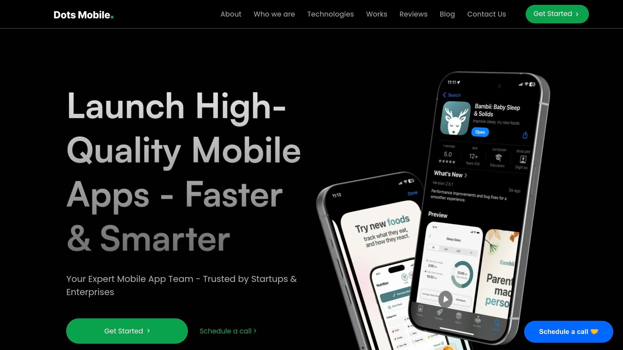
Creating app screenshots that convert requires more than just a good eye for design - it takes a mix of technical skills, strategic thinking, and a deep understanding of App Store Optimization (ASO). That’s where Dots Mobile steps in.
Dots Mobile doesn’t stop at designing screenshots. Their process starts with detailed market and competitor research to identify the best positioning opportunities. From there, they craft hypotheses around captions, feature highlights, and visual layouts, testing them rigorously through tools like Apple’s Product Page Optimization (PPO) and Google Play Store Listing Experiments.
Part of their strategy involves localization - tailoring both text and visuals to resonate with different regions. This isn’t just a nice touch; it can increase install rates by as much as 48% in multilingual markets. For example, when targeting Japanese users, they include locally relevant visuals like manga-inspired characters and imagery that aligns with cultural preferences.
Leveraging their experience in ASO, Dots Mobile turns these insights into polished designs that meet platform-specific requirements. Their attention to detail ensures compliance with standards like safe area optimization for Apple’s Dynamic Island and clean status bars (often showing 9:41 AM with full battery), delivering a professional look across all devices.
Beyond design, Dots Mobile offers full-stack mobile app development, using technologies like Swift for iOS and Kotlin for Android. This technical expertise ensures that the UI screenshots they create are authentic representations of the app’s actual functionality - an Apple requirement to avoid rejection. Their portfolio spans AI-driven apps in fitness, beauty, and lifestyle, showcasing their ability to build visually striking and user-friendly interfaces.
To streamline their workflow, the team uses automation tools like Fastlane. This allows them to capture and upload hundreds of screenshots across devices and languages in minutes instead of hours. This efficiency supports quicker testing and iteration cycles, a crucial factor for growth. In fact, companies running 10 or more A/B tests monthly grow 2.1 times faster than those that test less frequently.
App screenshots are more than just visuals - they're silent salespeople and crucial SEO tools that influence downloads in a matter of milliseconds. Research shows users form their first impressions in as little as 17 to 50 milliseconds, and nearly 90% of users never scroll past the third screenshot. This makes planning, designing, and testing your screenshots a must, not a choice.
Success begins with smart planning. Focus on what your users care about most and craft a visual story that highlights those needs. For example, swap technical language for benefit-driven headlines like "Organize Your Life in Seconds". Since June 2025, Apple has indexed screenshot text as searchable metadata, which means your visuals now play a dual role: boosting conversions and discoverability.
Design quality is key. Use professional mockups, high-contrast text, and layouts tailored to the platform. iOS users often prefer clean, lifestyle-oriented imagery, while Android users lean toward feature-packed, functional designs. Including up-to-date device frames, like the latest iPhone models, signals that your app is actively maintained and relevant.
"The difference between a download and a pass is often the story your screenshots tell. If they do not immediately convey value and solve a user's problem, you have lost a potential customer." - ScreenshotWhale
Once your screenshots effectively communicate value, testing ensures they deliver results. A/B testing - whether it’s tweaking a headline, background color, or mockup - removes guesswork and reveals what drives downloads. Localized listings can also increase installs by up to 48% in multilingual markets. With the app market expected to hit $138 billion and over 92 billion downloads by 2025, your screenshots aren’t just visuals - they’re a competitive tool that can set you apart.
Your first screenshot needs to immediately show what your app is all about and why it matters to users. Focus on showcasing its primary value or standout feature. Here are a few examples:
This strategy grabs attention right away and clearly communicates your app's main benefit.
Screenshot captions play a crucial role in boosting your app's visibility and rankings on the App Store. Apple uses optical character recognition (OCR) to scan and index the text within these captions, making them a direct ranking factor in App Store Optimization (ASO).
By including captions that incorporate keywords relevant to your app, you can improve your app's search visibility. Beyond rankings, captions also serve as a way to communicate your app's key features clearly and effectively, helping to engage users and drive more downloads.
When done right, optimized captions not only align your app with Apple's search algorithms but also provide potential users with a quick glimpse of your app's benefits - making it easier for them to decide to hit "Download."
The easiest way to test app screenshots is by using tools that come with built-in testing features, such as those in App Store Connect. These tools let you compare different sets of screenshots and track how they perform, giving you clear insights into what works best.
If you don’t want to use specialized tools, you can manually update your app's screenshots and monitor download rates over time. However, this method makes it much harder to pinpoint whether changes in performance are directly tied to your new screenshots.


