

February 5, 2026
⯀
11
min


Bad UI/UX design can ruin your startup's chances of success. Users quickly judge your product based on their experience - whether it's confusing navigation, unclear messaging, or slow mobile performance. The stakes are high: 88% of users don’t return after a poor experience, and 53% abandon sites that take over 3 seconds to load.
Here’s a quick breakdown of the 5 most common mistakes startups make:
Fixing these issues early saves money and boosts results. For every $1 spent on UX, businesses see a 9,900% ROI. Don’t let bad design become a barrier to growth.
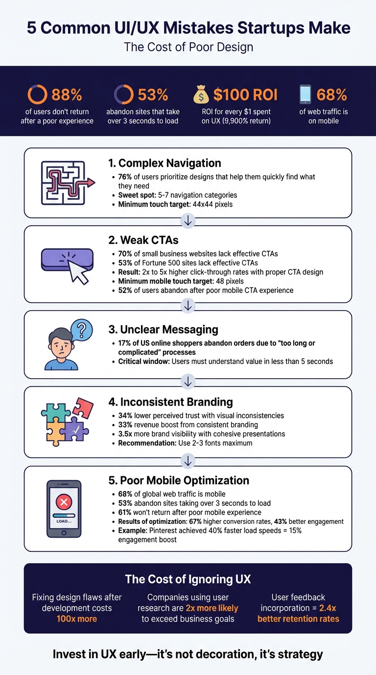
5 Common UI/UX Mistakes Startups Make: Statistics and Impact
Navigation is a cornerstone of user experience - 76% of users prioritize designs that help them quickly locate what they need. Yet, startups often make the mistake of cluttering navigation bars with too many menu options or hiding essential links behind hamburger menus on desktop screens. When users struggle to find what they’re looking for, they’re more likely to leave. This misstep often leads to a cascade of other navigation issues.
The situation gets worse when standard navigation conventions are ignored. For instance, users typically expect primary navigation to appear in the header for websites and on the left side for applications. Placing menus in unconventional spots, like the bottom-right corner, forces users to search unnecessarily. Similarly, relying on unlabeled icons - like a heart symbol - can confuse users and increase their cognitive effort.
A notable example? In 2024, the Metropolitan Opera's website faced criticism for tucking its main navigation under a hamburger menu, even though there was enough space to display it openly. This design choice caused users to miss critical content.
To avoid such pitfalls, keep your top-level navigation concise - five to seven categories is the sweet spot. Exceeding this limit triggers Hick’s Law, which states that more options lead to longer decision times. Toyota's mobile platform provides a great example: it uses a sequential menu with images, making it easier for users to navigate deep product structures while offering a clearer "information scent" than plain text lists.
Orientation cues are equally important. Tools like breadcrumbs, highlighted menu items, and "You Are Here" indicators help users stay oriented and reduce frustration. As Page Laubheimer, Senior UX Specialist at Nielsen Norman Group, explains:
"Navigation serves roles beyond wayfinding; it helps users to understand the scope of your resources or content".
Physical accessibility also plays a key role in navigation. Ensure touch targets are at least 44x44 pixels and spaced well enough to prevent accidental taps. Opt for click-activated submenus instead of hover-activated ones - they’re more reliable across all devices, including touchscreens. In 2024, Southwest Airlines revamped its mobile app by simplifying navigation paths and addressing inconsistencies across platforms, creating a more intuitive user journey informed by behavioral data.
Once navigation is clear, strong CTAs (Call-to-Action elements) are the next step to guide users toward completing their journey.
CTAs are the driving force behind user actions and conversions. Yet, research reveals a surprising gap: 70% of small business websites and 53% of Fortune 500 sites lack effective CTAs, leading to user drop-offs.
Aditi Gupta from VWO highlights the importance of CTAs:
"CTAs are your gateways from one stage of the conversion funnel to the other. Together, they lead to a final revenue conversion... a Call to Action gone wrong at any stage is a conversion gone wrong".
To create CTAs that users want to click, focus on clarity and usability. Buttons should stand out visually with clear backgrounds, rounded corners (around 30% of the button’s height), and drop shadows. Avoid vague labels like "Submit" or "Click here." Instead, opt for direct commands like "Create Account", "Buy Now," or "Get A Free Trial".
For mobile users, design is especially critical. Make touch targets at least 48 pixels wide and tall to reduce accidental taps and improve overall usability. Positioning matters too - place CTAs where they’re easy to reach, such as the bottom center or right, within the "thumb zone".
While many designers aim to keep CTAs "above the fold", the best placement is often just after presenting your value proposition - even if it requires some scrolling. This approach aligns naturally with user behavior and can significantly boost engagement. In fact, thoughtful CTA placement and design can lead to 2x to 5x higher click-through rates.
Too many options can overwhelm users, leading to decision paralysis. Limit primary CTAs to three or fewer in any given area. Use high-contrast colors for the main action button to draw attention, while secondary options can use subtler designs like border-only "ghost buttons" or simple text links. This visual hierarchy ensures users intuitively know where to focus.
Subpar CTAs can cost businesses dearly. 52% of users abandon a company after a poor mobile experience. To prevent this, ensure buttons have at least 8 pixels of spacing around them to avoid accidental taps.
Once you've nailed down clear calls-to-action, the next step is making sure your product's value is immediately obvious. If users can’t grasp what makes your product valuable right away, they’re likely to leave.
Clear and concise messaging is non-negotiable. As Don Norman, author of The Design of Everyday Things, puts it:
"When we make mistakes in design, we blame the user. But it is never the user's fault – it is always a failure of the design itself".
A common pitfall is falling into the "more is better" trap. Ed Frederici from Appfire highlights this issue:
"Many SaaS companies assume 'more features' equals 'more value,' but adding more features often comes with a more complex UX that doesn't consider user engagement, which leads to confusion".
Instead of overwhelming users with a laundry list of features, focus on what matters most: the specific problem your product solves and who it solves it for. Your value proposition should be boiled down to one clear, jargon-free sentence - something users can understand in less than five seconds. Why is this so important? Because 17% of US online shoppers have abandoned orders simply due to processes that were "too long or complicated".
To simplify things further, consider using progressive disclosure. This technique introduces advanced features gradually, allowing users to get comfortable with the basics first. Also, make sure the top three user actions are accessible with a single click. For startups, especially, keeping your messaging simple and direct is crucial for grabbing and holding attention.
At Dots Mobile, we believe clarity is the cornerstone of effective UI/UX design. Our process helps startups transform complex ideas into a single, compelling message - ensuring users instantly understand what makes your product stand out.
Once you've nailed down your product's value, your visual identity needs to back it up. Mismatched design elements don't just look sloppy - they can actively undermine trust and leave users feeling unsure about your brand.
For example, if your brand colors shift across pages or buttons behave differently depending on the screen, users may feel disoriented. In fact, websites with visual inconsistencies score 34% lower in perceived trust among users. For startups trying to build credibility, this can be a dealbreaker. Tony Caccavo, Director of Operations at TeamPassword, explains:
"Brand is essential in this market. Customers entrust us with sensitive information in their login records. Inconsistencies or an outdated design can cause some customers to question whether we are technologically up to date enough to keep that information secure".
When design elements don’t align, users are forced to relearn the interface on every page. This increases cognitive load and frustration. Something as simple as a blue action button on one screen and a green one on another can make users doubt the system’s reliability. Instead of relying on intuition, they’re forced to think through every interaction, which makes the experience more taxing.
To fix this, create a design system - a centralized style guide that includes your precise color palette (down to the hex codes), standardized typography, and reusable UI components. Stick to no more than two or three fonts: one for headings, one for body text, and possibly one for calls-to-action. The results? Consistent branding can boost revenue by 33%, and companies with cohesive brand presentations see 3.5 times more visibility compared to their inconsistent counterparts.
A great example is Dots Mobile, which uses a design system to ensure a seamless and uniform experience across all platforms. By maintaining visual consistency, they strengthen user trust and reinforce their brand’s message.
If your app or website doesn’t run smoothly on mobile, you’re likely losing users before they even get a chance to engage. Here’s why this matters: mobile devices account for over 68% of global web traffic. Plus, 53% of users abandon sites that take more than 3 seconds to load, and 61% won’t return after a poor mobile experience. These stats highlight just how critical mobile optimization is.
The consequences of neglecting mobile usability are clear. Take Color Labs, for example. This photo-sharing startup raised $41 million but shut down in 2012 due to an inefficient mobile interface. On the other hand, companies that invest in mobile performance often see big rewards. Pinterest is a great case in point. When they introduced lazy loading and fine-tuned their mobile performance in 2025, their page load speeds improved by 40%, leading to a 15% boost in user engagement and retention.
To create a better mobile experience, adopt a mobile-first design strategy. Focus on the most important content (think 80/20 rule), and make sure buttons are at least 44×44 pixels for easy tapping. Place key buttons within the "thumb zone" (the bottom two-thirds of the screen) for better usability. Why does this matter? Mobile-first designs can lead to 67% higher conversion rates and 43% better engagement.
But design isn’t the only factor - performance is equally critical. Use optimized image formats like WebP, implement lazy loading, and test your site or app on actual devices to ensure it runs smoothly.
Mike Hakob, Founder and CEO of Andava Digital, sums it up perfectly:
"A mobile Web site or app is like a handshake. It sets the tone. If it's clunky, confusing, or slow, users may assume your product or service carries the same lackluster energy".
To avoid these pitfalls, work with developers who are skilled in both iOS and Android platforms. Companies like Dots Mobile take a mobile-first, cross-platform approach that covers everything from design to App Store optimization. They focus on fast load times and intuitive navigation, proving that optimizing mobile performance is no longer optional - it’s a must-have for startups aiming to succeed.
Every UI/UX misstep - whether it's overly complicated navigation, weak calls-to-action, unclear messaging, inconsistent branding, or poor mobile optimization - adds layers of frustration for users and increases abandonment rates. These issues don't just harm the user experience; they can make achieving sustainable growth a daunting challenge.
The financial impact of poor UX design is undeniable. For every $1 invested in UX, businesses see a $100 return. On the flip side, fixing design flaws after development can cost up to 100 times more. Companies that prioritize user research are twice as likely to surpass their business goals, and those that incorporate user feedback see retention rates improve by an impressive 2.4×.
As Don Norman, author of The Design of Everyday Things, succinctly states:
"When we make mistakes in design, we blame the user. But it is never the user's fault - it is always a failure of the design itself".
Even minimal testing with just 5–10 target users can confirm your app's value proposition before diving into full-scale development.
To avoid these common pitfalls, expert guidance is essential. Dots Mobile helps startups navigate these challenges by focusing on user research, mobile-first design principles, and cohesive design systems. This ensures your app delivers immediate value while keeping users engaged and loyal.
Investing in strong UX isn't just about aesthetics - it's a business strategy that reduces churn, builds trust, and fosters growth. By addressing these mistakes early, startups can turn potential friction into a powerful advantage.
Startups can improve app navigation by focusing on making it clear, simple, and consistent. Overloading users with complicated or cluttered menus can frustrate them, so aim for a clean, straightforward structure where essential features are easy to locate.
To make the experience better, incorporate familiar icons, ensure a logical flow, and consider including a search bar for quick access to content. Testing the navigation with actual users is key - this helps uncover problem areas and provides valuable feedback. Small tweaks based on user suggestions can lead to a more seamless and intuitive experience, keeping users engaged and satisfied.
When creating CTAs, focus on making them clear, eye-catching, and action-driven. Start by using bold, contrasting colors for buttons so they stand out against the rest of the page. Position them strategically - think about placing them near important content or decision-making points where users are most likely to notice.
The language of your CTA matters, too. Opt for action-oriented phrases like "Sign Up", "Get Started", or "Download Now." These phrases clearly guide users toward the next step while keeping the message short and aligned with their goals.
To find what works best, conduct A/B testing. Experiment with different designs, wording, and placements to see which version drives the most engagement. A great CTA doesn’t just look good - it’s easy to understand, grabs attention, and smoothly directs users toward taking action.
Mobile optimization plays a crucial role in shaping user experience, engagement, and retention for startups. When an app or website is optimized for mobile, it ensures smooth navigation, quick loading times, and responsive design - essential elements to keep users happy and frustration-free.
Startups that focus on mobile optimization can build stronger trust with their audience, boost repeat usage, and fuel growth. In today’s mobile-driven world, providing a seamless experience on smartphones and tablets isn’t just a nice-to-have - it’s a must-have for success.


