

March 19, 2026
⯀
14
min


Custom app dashboards centralize your app's performance data, enabling better decision-making and saving time. They focus on actionable metrics like retention, revenue, and technical performance, helping businesses improve user engagement and profitability. Here's a quick breakdown:
Dashboards not only save time but also offer real-time insights, often recouping their investment within 6–12 months.
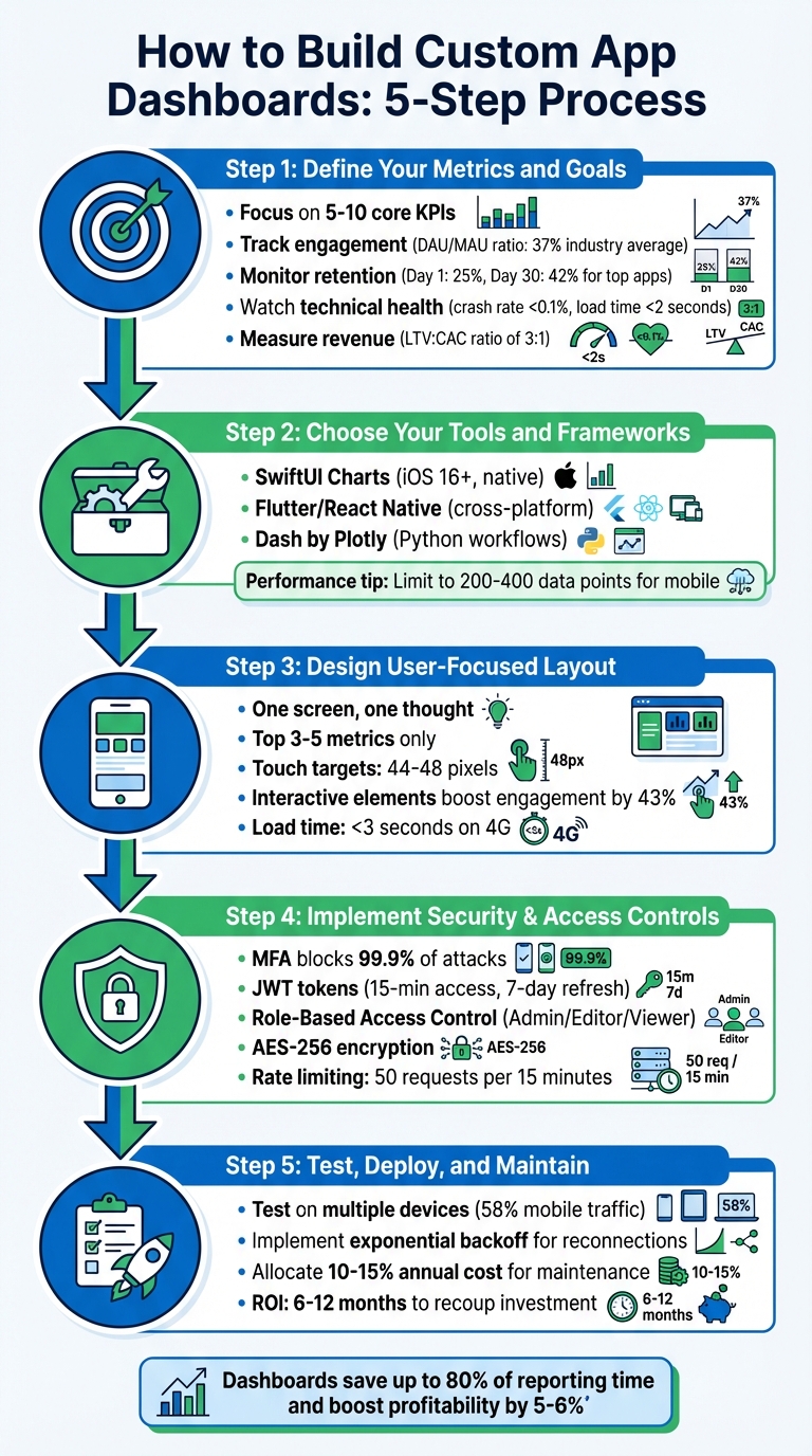
5-Step Process to Build Custom App Dashboards
The first step in building a successful app analytics strategy is deciding what to measure and understanding why it matters. Metrics should align with your app's stage of growth. For example:
Metrics should lead to clear, actionable insights. Ask yourself: If this metric changes, what action will I take? If you can't answer that, you might be tracking a vanity metric - like total downloads - that looks good but doesn't provide meaningful insights about user engagement or revenue.
From here, break metrics into core categories to focus on the most relevant Key Performance Indicators (KPIs).
Start by focusing on engagement metrics to understand how often users find value in your app. A key indicator here is the DAU/MAU ratio, also known as "stickiness." A 20% ratio is considered solid, while the 2024 industry average hit 37%. Social and messaging apps often exceed 50%, whereas utility apps typically range between 10–20%.
Retention metrics are essential for evaluating product–market fit. On average, apps see a Day 1 retention rate of about 25%, but top-performing apps achieve Day 30 retention rates around 42%. A smooth onboarding process can improve long-term retention by as much as 50%.
"Retention is often considered the most important indicator of product-market fit".
Don't overlook technical performance metrics. Issues like crashes and slow load times have a direct impact on user behavior - 62% of users uninstall apps due to crashes or errors. Leading apps aim for crash rates below 0.1% and load times under 2 seconds.
For revenue tracking, keep an eye on metrics like Average Revenue Per User (ARPU), LTV, and CAC. A healthy LTV:CAC ratio is at least 3:1.
| Metric Category | Key KPIs | Why It Matters |
|---|---|---|
| Technical | Crash Rate, Load Time, ANR Rate | Prevents uninstalls; 62% leave due to errors |
| Engagement | DAU/MAU, Session Length | Tracks "stickiness" and habit formation |
| Retention | Day 1/7/30 Retention, Churn | Indicates long-term viability and product–market fit |
| Financial | ARPU, LTV, CAC, ROI | Evaluates commercial health and marketing efficiency |
| UX/Design | Rage Taps, UI Freezes, Screen Flow | Highlights friction points in the user journey |
Once you've identified your core metrics, the next step is translating them into SMART goals - Specific, Measurable, Achievable, Relevant, and Time-bound. For instance, aim to reduce your crash rate to below 0.5% within the next quarter. This approach ensures your dashboard isn't just a collection of numbers but a tool for making decisions.
To avoid overwhelming your team, limit your dashboard to 5–10 core KPIs.
"Limit your KPIs. Clarity beats quantity. A dashboard should help people act, not guess".
It's also crucial that every metric is controllable by the team responsible for it. If a team is held accountable for metrics they can't directly influence, the dashboard loses credibility.
Finally, distinguish between diagnostic metrics and performance metrics. Diagnostic metrics, like rage taps (indicating user frustration), help pinpoint problems. Performance metrics, such as revenue or retention, show how well you're meeting your goals. Both are vital but serve different roles in your strategy.
With your metrics and goals clearly defined, you're ready to choose the right tools and design a dashboard that drives informed decisions.
Once your metrics are set, the next step is selecting tools that integrate seamlessly with your existing tech stack. This decision lays the groundwork for creating a dashboard that's efficient and easy to use.
For native iOS development, SwiftUI Charts is a great option. It allows you to build interactive charts with minimal coding and no need for third-party libraries. As Sanjay Nelagadde, a Senior Software Engineer, puts it:
"With the SwiftUI Charts framework introduced in iOS 16, you can now plot beautiful, interactive charts natively... no need to add external dependencies."
Keep in mind: SwiftUI Charts requires iOS 16 or newer.
If you're working on a cross-platform project, Flutter and React Native are solid choices. Flutter uses a widget-based architecture, enabling you to create dashboards for both Android and iOS from a single codebase. It also offers charting libraries like fl_chart for animated, flexible visuals and charts_flutter for more standard layouts. React Native, powered by JavaScript and a virtual DOM, excels in handling data-intensive dashboards. Both frameworks support hot reload, making it easier to iterate and test mobile app UI/UX design choices quickly.
For Python-heavy teams, Dash by Plotly is an excellent option. Dash combines Flask, React.js, and Plotly.js into a Python-centric workflow, removing the need for deep expertise in HTML, CSS, or JavaScript. While it’s primarily web-focused, Dash can be used to deploy analytical dashboards accessible via web views in mobile apps.
Performance is a critical factor when building dashboards for mobile devices. Here are some key considerations:
RepaintBoundary to minimize UI lag.With your tools ready, the next step is crafting a dashboard layout that prioritizes user needs. The goal? A design that’s both clear and efficient.
When it comes to mobile dashboards, prioritization is key. Users need quick access to the most critical metrics - usually three to five - that help them make fast decisions. As the Boundev Team puts it:
"Mobile data visualization isn't a layout problem. It's a prioritization problem."
Stick to the "one screen, one thought" rule: each view should answer one specific question to prevent overwhelming users. Place the most important KPIs in the top-left quadrant, where attention naturally gravitates. Use size, color, and whitespace to emphasize these metrics. For example, in a fitness app, today’s step count might take center stage, while secondary stats like calories burned or distance traveled could be accessible via a tap.
Adopt progressive disclosure to show high-level numbers first and let users drill down into detailed charts or data as needed. This method reduces mental effort by 37% compared to displaying everything at once. Since mobile screens can only show three to five data points, avoid cramming in too much information. Finally, choose chart types that make data easy to interpret.
The right chart type can make all the difference in turning raw data into actionable insights. Horizontal bar charts are a great choice for mobile because their left-aligned labels make long lists easy to browse. Sparklines - tiny trend indicators placed next to key numbers - offer valuable context without taking up extra space. For time-based data, simple line charts with one or two series work best.
Some chart types, like scatter plots, don’t translate well to mobile because their small points can be hard to interact with. If you need to show part-to-whole relationships, stick to donut or pie charts with no more than five to seven segments, and place the legend below for clarity. For detailed records, consider using stacked cards instead of traditional tables. These cards can display one record at a time with key fields clearly labeled.
Adding interactive elements can increase engagement by 43% compared to static visuals. For mobile users, replace hover states with tap actions and ensure tooltips don’t get obscured by fingers. Make touch targets at least 44–48 pixels wide to avoid accidental taps, and use SVG-based charts to ensure sharp visuals across screen resolutions.
Keep accessibility in mind, too. Around 8% of males experience red-green color blindness, so don’t rely solely on color to convey meaning. Add patterns, icons, or other indicators, and follow WCAG 2.1 contrast standards. Always include a "last refreshed" timestamp to keep users informed about how current the data is.
Designing for mobile means considering the "thumb zone" - the bottom 40% of the screen that’s easiest to reach with one hand. Place essential controls like filters, date selectors, and navigation buttons here. Use large, clear buttons for primary actions, and keep secondary options minimal to avoid clutter.
Card-based layouts work well for grouping related metrics, offering clear separation and improving readability. Consistency in colors, fonts, and layout is equally important for intuitive navigation. As The Data Scientist explains:
"Consistency is better than beauty in design. This is because beauty is subjective. Consistency, in turn, is measurable."
To ensure a smooth experience, dashboards should become interactive within three seconds on mid-range devices over 4G. Use skeleton screens and lazy loading for charts below the fold to speed up perceived load times. Avoid "scroll hijacking" by using two-finger zoom or a dedicated expand button instead of letting charts take over scrolling.
Finally, use animations thoughtfully to highlight data changes - like a bar growing to show an increase - rather than as decorative extras. When users interact with a button or filter, provide immediate feedback, such as a spinner or color change, to confirm their action was registered. These thoughtful design elements help create a dashboard that’s clean, easy to use, and packed with functionality.
At Dots Mobile, these principles are at the heart of how we design dashboards that not only look good but also deliver a seamless, user-friendly experience.
Once your dashboard is user-friendly, the next priority is locking it down. Security is non-negotiable - it’s the backbone of protecting sensitive data and preventing unauthorized access. A dashboard without proper protections can leave critical information exposed.
Start by integrating multi-factor authentication (MFA). This step alone can block 99.9% of automated account attacks. Combine MFA with JWT-based authentication using short-lived access tokens (around 15 minutes) and longer refresh tokens (about 7 days). This setup minimizes the risk of token hijacking. For password storage, rely on Argon2id with specific parameters: 19,456 KB memory size, 2 iterations, and a parallelism factor of 1. With this configuration, even a password with 60 bits of entropy would take an average of 3.7 million years to crack at 10,000 attempts per second.
Role-based access control (RBAC) is another essential layer. It defines what users can do based on their roles. Use a simple resource:action structure like report:edit or user:delete to organize permissions. Here's a quick look at how roles align with dashboard access:
| Role | Permissions | Typical Dashboard Access |
|---|---|---|
| Admin | view, edit, delete, manage_users |
Full access to all metrics and system settings |
| Editor | view, edit |
Can modify data and visualizations but cannot delete resources |
| Viewer | view |
Read-only access to specific metrics and reports |
To make this work, enforce these permissions on the server side. While frontend checks improve the user experience, only backend validation ensures true security. Middleware can help intercept and block unauthorized requests to sensitive routes like /admin or /settings before rendering any content. For database-driven dashboards, implement Row Level Security (RLS) policies. These ensure users only access data relevant to their role or ownership.
Additionally, secure sensitive data both in transit and at rest. Use TLS/HTTPS to protect data as it moves between the app and server, and rely on AES-256 encryption for storing critical fields like financial details. Other safeguards include rate limiting - such as 50 requests per 15 minutes - to thwart brute-force attacks. Maintain detailed audit logs that capture every admin action, including user ID, action performed, timestamp, and IP address. These measures not only protect your dashboard but also keep it user-friendly.
With your secure and user-friendly design in place, the final steps - testing, deploying, and maintaining your dashboard - are critical to ensuring its long-term success.
Start by testing your dashboard with real users. This means running usability tests through surveys, interviews, or direct observation to pinpoint areas where users might encounter challenges. At the same time, performance testing with full-scale datasets will help you uncover issues like slow query speeds, caching problems, or sluggish API responses. Considering that mobile devices made up 58% of global website traffic in the first quarter of 2023, it’s essential to test the dashboard on various devices and screen sizes.
For mobile users, ensure that touch targets meet recommended guidelines (refer back to Step 3). Since mobile devices don’t use cursors, avoid hover-based interactions and instead rely on tap gestures or clear prompts like "Tap bar to view details." Accessibility is just as important - conduct audits to confirm proper color contrast, keyboard navigation options, and descriptive alternative text for screen readers. Before a full release, share the dashboard with a small pilot group to gather feedback and make any necessary adjustments.
Once the dashboard passes usability and performance tests, you’re ready to move on to deployment.
When deploying your dashboard, ensure a stable connection is a top priority. Use the security measures and mobile optimizations you’ve already established. For WebSocket reconnections, implement exponential backoff - starting with a 1-second delay and doubling it up to 30 seconds - to handle connection interruptions effectively. Pair this with heartbeat mechanisms to detect dropped connections and queue data until the link is restored.
It’s also helpful to include a connection status indicator so users can see whether live data is streaming. Validate all incoming data on the client side to prevent crashes caused by errors in backend responses. When going live, use secure WebSocket connections (WSS), enforce authentication tokens, and apply rate-limiting on the server to enhance security. Additionally, monitor memory usage with browser developer tools to catch any potential leaks early.
Deployment is just the beginning - ongoing maintenance will keep your dashboard running smoothly.
To keep your dashboard relevant and functional, plan for regular updates. As business priorities shift, you may need to tweak performance metrics or introduce new features. A good rule of thumb is to allocate 10–15% of the dashboard’s initial cost annually for maintenance and updates. Automated data quality checks can also be a lifesaver, alerting you to issues like missing fields or broken links, which helps maintain user confidence in the dashboard’s reliability.
Rather than making large, disruptive changes, embrace an iterative design approach. Use user feedback to guide smaller, incremental improvements. During updates, maintain consistency in your design - stick to the same colors, fonts, and button styles to ensure a seamless user experience. As MaybeWorks aptly stated:
"A $50K dashboard that the CEO never opens is just a screensaver".
A custom dashboard transforms raw data into actionable insights. To make it effective, focus on a handful of key KPIs. As the Graphed team wisely states:
"A good dashboard moves you from guessing to knowing".
Strategic planning is the backbone of a secure and user-friendly design.
First impressions matter - 94% of them are tied to design. Prioritize clean visualizations and intuitive layouts, paired with strong security measures like Role-Based Access Control and data encryption. These elements build trust and ensure a seamless user experience.
But the work doesn’t stop after launch. Ongoing maintenance is essential for retaining users. Schedule regular tasks like data validation, security audits, and performance reviews to tackle potential problems before they escalate. Frequent updates will keep your dashboard relevant and aligned with your business goals.
Custom dashboards can drive growth, often recouping their investment within 6–12 months. Starting with a lean MVP lets you adapt based on real-world feedback, ensuring your dashboard remains a powerful, evolving tool for your business.
To effectively measure your app's success, focus on KPIs that directly align with your goals and provide practical insights. Start with these key metrics:
These metrics lay the groundwork for understanding your app's performance and making informed decisions.
Choosing the right framework boils down to your project’s requirements, your technical expertise, and the features you’re aiming to include. Flutter works well if you’re building cross-platform dashboards that need to be scalable, deliver strong performance, and maintain visual consistency. For projects that demand highly interactive and customizable dashboards, React Native or shadcn/ui could be better options. The key is to align your framework choice with your project’s scope and the specific functionalities you want in your dashboard.
Securing sensitive dashboard data requires a strong focus on security measures to keep information safe. This includes implementing secure API protocols, such as OAuth 2.0, which handle authentication and authorization effectively. Pair this with AES-256 encryption to safeguard data during transfer.
To bolster protection further, use API-layer validation to verify data integrity and prevent unauthorized access. Incorporating automated security regression testing ensures that vulnerabilities are identified and addressed promptly, helping maintain compliance and reducing the risk of data breaches or leaks. Together, these practices create a solid defense for sensitive information.


