
March 12, 2026
⯀
12
min


Mobile app onboarding is your chance to make a strong first impression. With 25% of apps abandoned after one use and 77% of users leaving within three days, guiding users effectively from the start is critical. The goal? Help users quickly reach their "aha moment" - the point where they see how your app improves their life. Here’s how to do it:
Tracking metrics like activation rates, Day 1 retention, and drop-off points can help refine your process. Apps with effective onboarding see 50% better retention and users who experience value within 60 seconds are 3–5x more likely to stay. Nail these steps, and you’ll turn new users into loyal ones.

Mobile App Onboarding Statistics and Best Practices
Effective onboarding is built on three key ideas that encourage user engagement and retention.
Short and sweet - that’s the goal for onboarding. Ideally, the process should take no more than 1 to 3 screens or 3 to 7 steps. Overloading users with information increases the risk of abandonment. Every additional screen you add makes it more likely users will quit before they even experience your app’s value.
Remember, users downloaded your app to solve a problem or complete a task - not to sit through a lengthy tutorial. Keep instructions brief and clear. If you can’t explain a feature in one sentence, it’s probably too complicated.
Simplifying the process is important, but tailoring the experience to individual users can make it even more effective.
Personalization isn’t optional - it delivers measurable results. Apps that implement personalized onboarding see an 8.5% increase in trial starts and a 17% boost in paying conversions. In the US, these numbers are even higher: a 27% increase in paying conversions and a 35% rise in Average Revenue Per User (ARPU).
A simple welcome survey can help you segment users by their goals and preferences. Ask 3 to 5 targeted questions to understand what they want to achieve, then show them only the features that match their needs. For example, an entertainment app increased payment conversions by 40% on iOS with a longer, highly personalized onboarding flow. Similarly, an education app removed a loading screen during its personalized flow and saw a 22% rise in trial conversions and a 30% increase in ARPU.
"Every item on your checklist has to be hyper-relevant for the user, with the ultimate goal of getting them to that 'aha!' moment. It has to be short, actionable, and clear." - Nick Bouchard, Founder, Word Merc Marketing
It’s also important to let users skip personalization questions if they prefer to explore the app on their own. Forcing a survey can create unnecessary friction for those who just want to dive in.
Once users are engaged, introduce features gradually to avoid overwhelming them.
Dumping all your features on users at once is a recipe for disaster. Progressive disclosure - introducing features as they become relevant - helps users absorb information without feeling overwhelmed. Showing too much too soon often leads to confusion, frustration, and abandonment.
Contextual onboarding is a great way to implement this. For instance, if a user taps a camera icon, that’s the perfect moment to explain your photo editing tools - not during an initial walkthrough. This "just-in-time" approach helps users understand your app naturally while highlighting its value at the right time.
Apps that use tailored onboarding checklists and segment users by experience level have reported a 26% increase in installation completions. The key is to map out your user journey, identify the most important "core win", and design your initial flow around achieving that goal before introducing additional features.
The signup screen is often where users drop off, so it’s crucial to show your app’s core value upfront. Letting users experience key features before asking for account creation - often called gradual engagement - can help build trust and reduce hesitation about sharing personal details.
Take Wise (formerly TransferWise) as an example: they highlight exact exchange rates and fees before asking users to sign up, tackling a major concern with clear transparency. Similarly, Coinbase uses a step-by-step visual timeline for its Know Your Customer (KYC) process, easing the discomfort of sharing sensitive data. Below are some strategies to lower signup barriers and make early interactions more engaging.
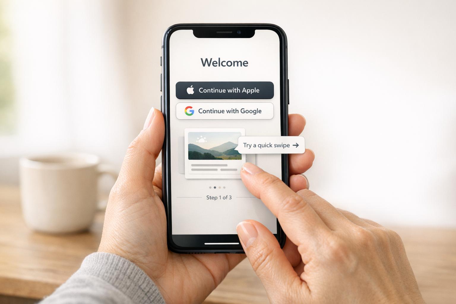
Simplifying the signup process is a direct way to increase user engagement. Offering one-tap social logins (like Apple, Google, or Facebook) cuts down on form-filling and streamlines the experience. Including options like "Guest Mode" or "Skip" allows users to explore the app before committing to register.
When asking for permissions - such as access to the camera, location, or notifications - use permission priming. This involves showing a brief, custom explanation of why the permission is needed before the system dialog appears.
"Bombarding users with permission dialogs right after they log in looks like a data mining attempt. I recommend 'permission priming.'" - Abrar Abutouq, Product Manager at Userpilot
Static slideshows are outdated. Instead, use interactive tutorials that require users to complete small tasks. This hands-on approach helps users learn by doing, building confidence and familiarity more effectively than passive walkthroughs.
For example, in 2025, Hotjar introduced a personalized onboarding checklist tailored to different experience levels - Beginner, Intermediate, and Advanced. This change led to a 26% increase in successful installations. Similarly, the health app Yazio uses a tactile interaction where users tap and hold an icon to confirm their goal. This small action creates a sense of commitment, encouraging follow-through.
Adding gamification elements can also make a big difference. Features like progress bars, celebratory confetti, and motivational messages after completing steps can keep users motivated. Duolingo, for instance, boosted its day-one retention by 24% by introducing achievement badges and celebrations for completing initial onboarding steps. These small rewards transform the process from a chore into something fun and rewarding.
When introducing your product, focus on the outcomes rather than the features. People aren't interested in technical jargon like "AI-powered algorithm" or "cloud-based infrastructure." What they care about is how your product will help them save time, reduce stress, or achieve their goals. For example, in A/B tests, onboarding copy that emphasized outcomes boosted trial conversions by 17% and increased Average Revenue Per User (ARPU) by 13% compared to feature-focused messaging.
Instead of saying, "Set custom filters", reframe it as, "Find exactly what you're looking for in seconds." Keep the initial feature introduction limited to 3–5 essential capabilities to avoid overwhelming new users. Use progressive disclosure to introduce additional features gradually as users explore the app. This is especially important since a large number of users abandon apps after just one use.
These strategies align perfectly with earlier discussions about reducing friction to gain user trust.
Building on the idea of outcome-driven messaging, prioritize showing users how your product benefits them. Every feature should be framed in terms of what it accomplishes for the user. Visual aids like "before and after" comparisons can quickly illustrate the value. For instance, a budgeting app shouldn't just explain how to categorize expenses - it should show users how those categories translate into actionable financial insights.
In 2025, an education app tested a "survey-plus-lesson" onboarding process that combined personalization with immediate value delivery. This approach resulted in a 25% increase in trial starts and a 78% boost in ARPU by helping users experience value right after customizing their journey. The key takeaway? Guide users to their "aha moment" - the first time they see real value - within the first 60 seconds.
Keep your messaging concise. Tooltips should be under 140 characters, paired with bold, action-oriented headers. Use contextual tooltips that appear only when users interact with a feature for the first time, rather than generic pop-ups that disrupt their flow.
Once the benefits are clear, give users the freedom to personalize their experience. Everyone has different needs and skill levels, so let them select their onboarding path by answering 2–3 targeted questions upfront. This helps segment users by their specific goals.
For example, a 2025 productivity app trial demonstrated how a tailored onboarding flow increased paying conversions by 17% and ARPU by 22%. This approach works across various app types. Pinterest, for instance, allows users to pick their interests upfront to customize their feed, while Duolingo asks about learning goals to provide relevant features. The pattern is clear: when users feel understood, they’re more likely to stay engaged and explore further.
Always offer a "Skip" option to respect user preferences. Some people prefer hands-on exploration over tutorials, and giving them that choice ensures a smoother experience.
At Dots Mobile, we incorporate these proven strategies into our app development process, ensuring that every user quickly discovers the app's core benefits.
Refining your onboarding process is key to turning initial user interest into long-term engagement. By tracking the right metrics, you can determine if users are reaching their "aha moment." Surprisingly, only 19.2% of users complete onboarding, while top-performing apps see completion rates of 40–50%. This gap often stems from teams overlooking crucial metrics or failing to act on them. These numbers provide a foundation for ongoing improvements.
One essential metric to watch is the activation rate - the percentage of users who take a key action. Also, monitor the time to first core action (aim for under 60 seconds) and drop-off rates per step to identify where users encounter friction. For instance, Vertigo Games analyzed a 60-step tutorial from 2023 to 2025 and used session recordings to address a major drop-off at step 46.
Another critical indicator is Day 1 retention, which reflects how effective your onboarding process is. Apps with well-designed onboarding often achieve Day 1 retention rates of 40–60%, compared to less than 25% for poorly executed flows. Additionally, users who experience a core feature within the first 60 seconds are 3–5 times more likely to stick around.
It's not just about tracking the number of users who complete onboarding - it’s about understanding their behavior. For example:
Another useful metric is the termination rate, which flags the last action users take before leaving. This can help pinpoint where users drop off. Segmenting metrics by acquisition source is also insightful - organic users typically have 50–80% higher completion rates than paid users, likely due to stronger intent. These insights help target and resolve friction points effectively.
Improving onboarding requires consistent testing and iteration. A/B testing, for example, is invaluable for separating assumptions from actual results. In 2025, a productivity app discovered that emphasizing outcome-focused messaging like "get answers instantly" boosted trial conversions by 17% and Average Revenue Per User (ARPU) by 13%. Similarly, an education app found that combining a trial lesson, a survey, and a follow-up lesson increased trial starts by 25% and ARPU by 78%.
When running tests, use sequential approaches to identify what drives performance. If your app has high traffic (10,000+ daily installs), consider using 80/20 or 90/10 test splits instead of 50/50 to minimize revenue risks if a variant underperforms. Focus on structural changes - like reducing the number of steps or improving personalization logic - rather than minor tweaks like button colors.
"If your onboarding hasn't been touched in six months, something's wrong." - Victoria Kharlan, Adapty
Set up alerts for significant drops (35% or more) at specific funnel steps to quickly address technical bugs or user experience issues. Just like optimizing paid acquisition campaigns, regular testing is critical to keeping up with user expectations.
Effective onboarding is the bridge between a simple download and long-term user loyalty. Poorly designed onboarding flows can lead to abandonment rates as high as 80%, while well-crafted ones can increase retention by 50%. With 77% of daily active users leaving within just three days, nailing your onboarding process isn’t optional - it’s essential.
The formula for success? Simplicity, personalization, and constant improvement. Keep your onboarding flow concise and focused, delivering value within the first 60 seconds. Personalize the experience to match user goals and experience levels. For example, Hotjar’s decision to segment its onboarding checklist led to a 26% increase in installations. Breaking down features into smaller, more manageable steps using progressive disclosure can also help minimize cognitive overload.
As Elizabeth Alli, Founder of DesignerUp, puts it:
"The best onboarding isn't about locking users in - it's about showing them why they'd never want to leave." - Elizabeth Alli
Onboarding isn’t a one-and-done effort. Continuously track metrics like activation rates, time to core action, and Day 1 retention. Apps with Day 1 retention rates of 40–60% consistently outperform those stuck in the 15–25% range. Use A/B testing to refine your approach and act on the insights you gather.
The key is simple: show users the value that brought them to your app as quickly as possible, and guide them smoothly to their "aha moment."
An “aha moment” is that pivotal experience when users suddenly grasp the value your app brings to their lives. It’s the moment when everything clicks - when the app’s purpose aligns perfectly with what they need. This connection not only increases engagement but also encourages users to return, building a stronger, lasting relationship with your product.
When asking users to sign up or grant permissions, timing is everything. Make these requests contextually relevant and ensure users have already experienced value from your app.
For permissions, tie the request to specific, relevant actions. For example, if your app needs location access, prompt users when they’re about to use a feature that clearly benefits from it. Always explain why the permission is necessary and how it enhances their experience. Clear communication can make a big difference in acceptance rates.
For sign-ups, integrate the process seamlessly into the onboarding flow. Highlight key features first, showing users what they gain by signing up. This approach keeps the experience smooth and engaging, rather than feeling like a barrier.
Above all, focus on making the process simple and user-friendly. When users understand the purpose and see the value, they’re far more likely to say "yes."
When it comes to onboarding, tracking the right metrics can make all the difference in understanding and improving user engagement and retention. Some of the key ones to focus on include:
By keeping a close eye on these metrics, you can pinpoint problem areas and make adjustments to create a smoother, more engaging onboarding process.


