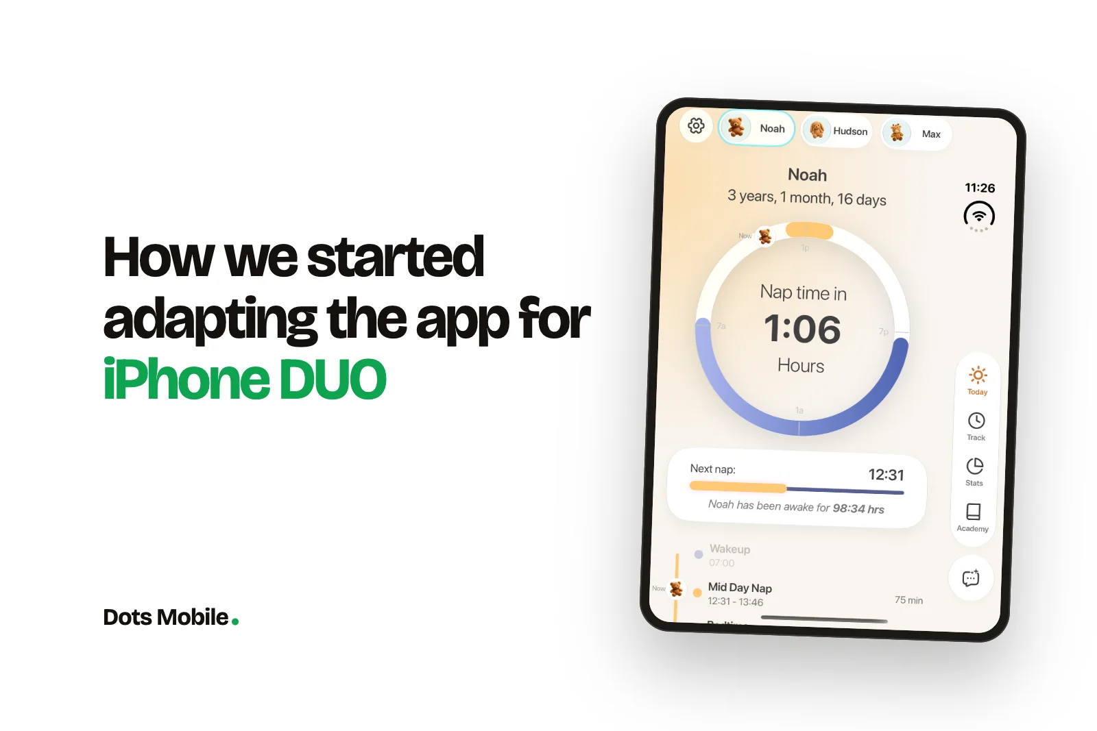
How we adapted Bambii for iPhone Duo
iPhone Duo went on sale on October 23. Apps that weren’t updated still run on it, but they sit letterboxed in the middle of the inner screen, the way iPhone-only apps look on an iPad. For Bambii, a baby sleep and feeding app that parents open one-handed at 3 a.m., that wasn’t good enough. Here’s how we adapted it, from the first look at the device to the release that shipped on November 11.
Size is now a range
On a regular iPhone you design for a few known screen sizes. On iPhone Duo, one app can show up on the compact outer display, the large inner display, partially folded, rotated, or sharing the screen with another app in Split View. So we stopped asking “what size is the screen?” and started asking “how much space does this view have right now?” Every layout decision now comes from the bounds of the scene or the parent view, never from the device model or the screen dimensions.
The sleep clock had to scale, not stretch
Bambii’s main screen is built around a 24-hour ring. It shows sleep windows, the next nap and a “Now” marker that moves through the day. A stretched ring looks broken right away, so we sized it relative to its container and let it grow with the space it gets. On the inner display, the ring, the next-nap card and the start of the day’s timeline now fit on one screen. On the outer display it collapses back to the familiar phone layout.
Navigation moved to the side
In some poses, iPhone Duo shows navigation bars, toolbars and tab bars vertically along the edge of the screen. Bambii’s main sections (Today, Track, Stats, Academy) now sit in a vertical rail on the trailing edge, each with an icon and a label. Ask Bambii, the AI assistant, gets its own button underneath so it’s always within reach. Because we used the system’s own navigation containers, the switch between horizontal and vertical bars is handled for us. We didn’t have to maintain two separate navigation setups.
Room for the whole family
Many families track more than one child, and caregivers share the same log. The wide inner display lets every child profile fit in one row at the top. Switching from one child to another is a single tap, with no scrolling and no menu.
Watch the fold
When the device is partially folded, the middle of the screen becomes a hinge, and anything placed there is hard to read and hard to tap. iOS reports this area to the app as a reserved region. We checked every screen, sheet and popover to make sure no key control lands on the fold, especially the buttons parents use most, like starting a nap or logging a feed.
Test every pose, then ship
We went through the app screen by screen in every pose: closed, open, partially folded and rotated. We checked that nothing moved awkwardly or got cut off as the device opened and closed. The same resizing work also covered smaller tablets, so iPhone Duo and iPad mini layouts shipped together in Bambii 3.1.3.
iPhone Duo doesn’t need a separate app. It needs an app that can adapt to any amount of space. If your layouts depend on the container rather than the device, use the system’s navigation, and keep the fold clear, most of the work is already done. What’s left is deciding how to use the extra space, and that’s where a product can stand out.
 StrategyFlutter or native: how we actually decide
 DevelopmentHow we use AI in development — and where we don't
 DesignOnboarding that keeps day-seven users
 StrategyHow much does an app cost? The honest breakdown
 Design7 mobile app design trends to watch in 2026
 DevelopmentClean code in mobile development
 StrategyHow to validate your app idea before building
 DesignHow to Build Custom App Dashboards
 DevelopmentSolving Memory Bottlenecks in Multithreaded Apps
 DesignBest Practices for Mobile App Onboarding
 DevelopmentPWA vs Native vs Hybrid: Key Differences
 DesignHow to Design App Screenshots for Maximum Impact
 Growth7 Content Marketing Tips for App Launches
 DesignHow to Build Scalable iOS Apps with Swift
 StrategyMobile App Feature Planner Made Easy
 DevelopmentXcode vs Android Studio: Key Differences
 DesignHow to Build a Personalized Recommender System
 DesignUI/UX Design Checklist for Perfect Apps
 GrowthApp Store Keyword Finder for Better Reach
 Development10 Best Practices for Real-Time Data Sync
 DevelopmentCase Study: Scalable Backend for Fitness Apps
 Design5 Common UI/UX Mistakes Startups Make
 DesignHow SwiftUI Simplifies iOS UI Design
 GrowthApp Visibility Metrics: What to Track in 2025
 DevelopmentiOS vs Android Development: Which Platform First?
 GrowthFreemium vs. Subscription: App Monetization Models
 Growth10 Gamification Techniques for App Retention
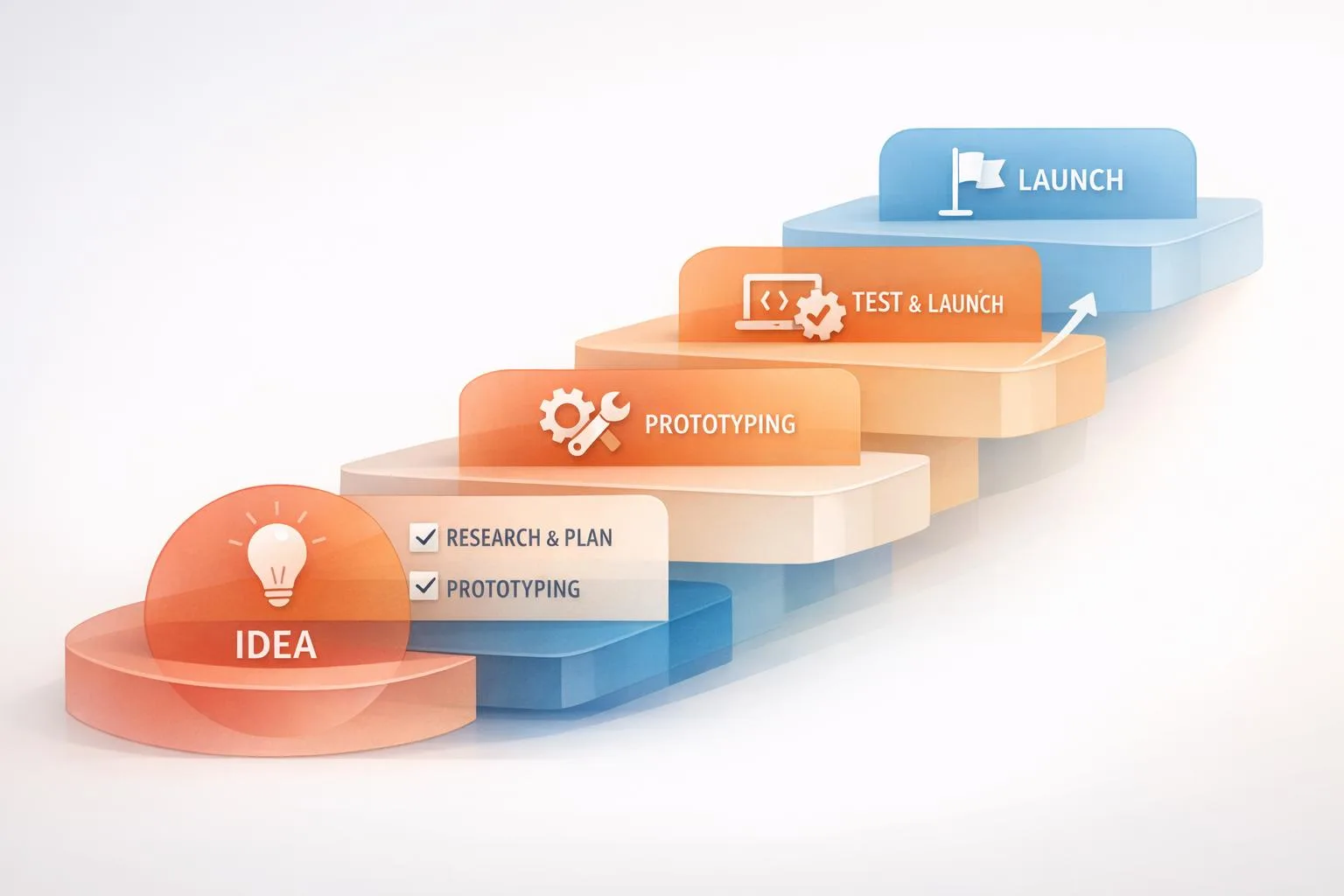 StrategyStep-by-Step MVP Development Process Explained
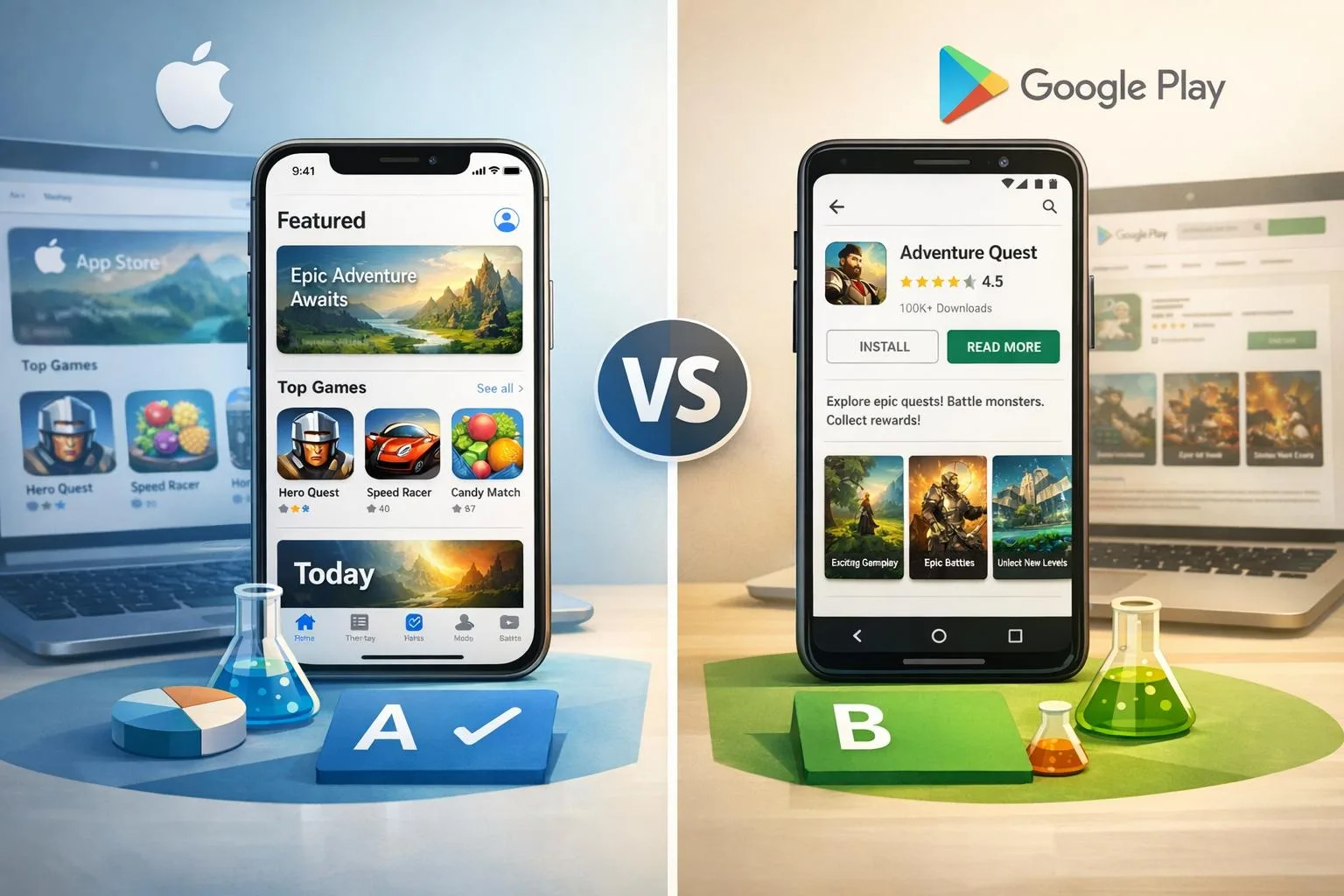 GrowthApp Store A/B Testing vs. Google Play Experiments
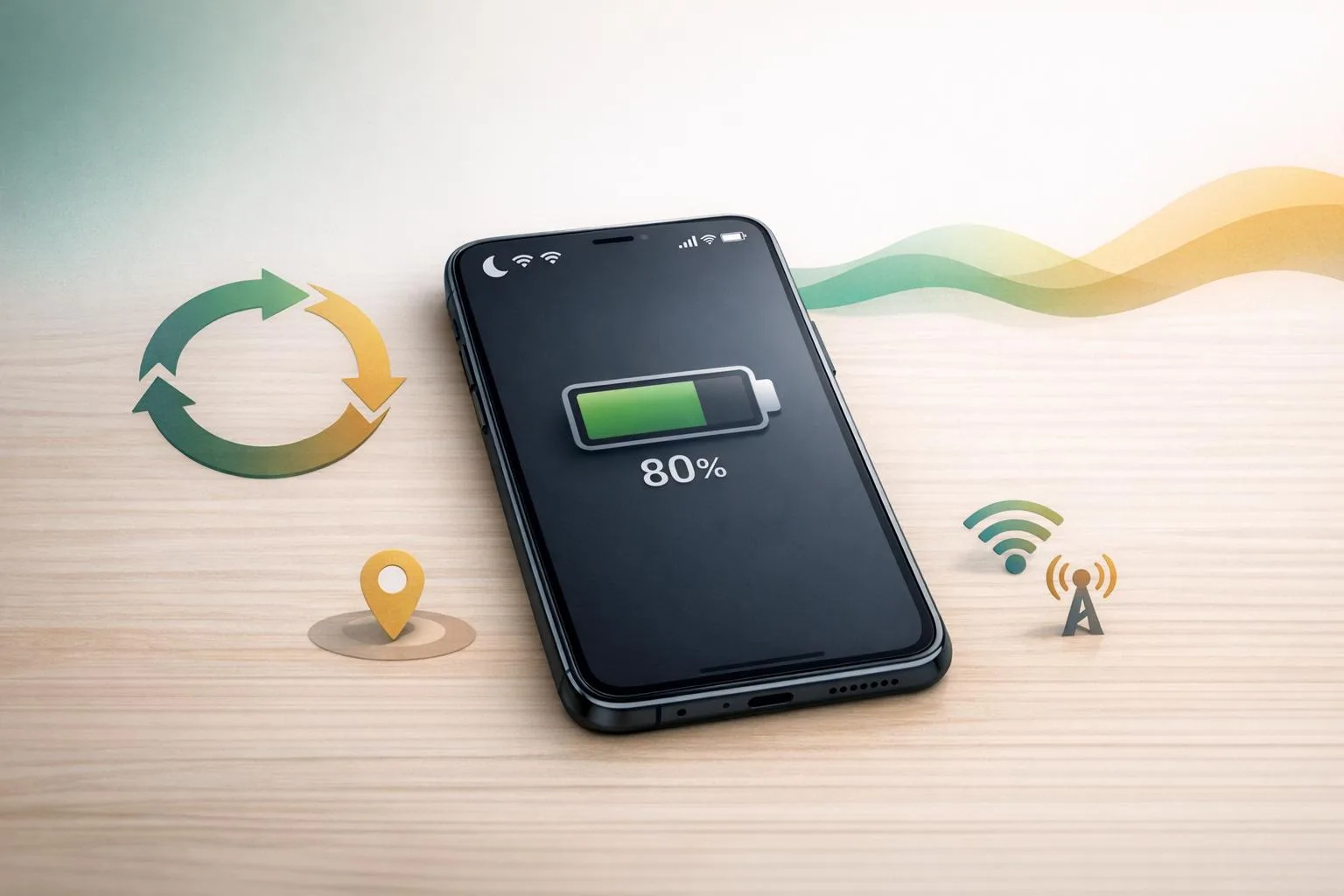 DevelopmentBest Practices for Mobile App Battery Efficiency
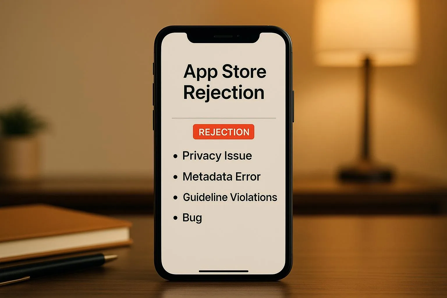 GrowthCommon App Store Rejection Reasons
 StrategyHow to Choose a Tech Stack for Startup Apps
 DesignBest Practices for Voice UI Design in Mobile Apps
 StrategyMobile App Development Checklist for Startups
 StrategyMVP Prototyping for Non-Technical Founders
 DesignMobile App UI/UX Design: Common Questions Answered
 GrowthLow User Engagement? 7 Mobile App Solutions
 GrowthApp Store Optimization: 8 Tips for Better Rankings
 DesignMobile App Development Cost: 2025 Pricing Guide
 Growth10 Steps to Launch Your First Mobile App
 DevelopmentBest Mobile App Development Tools in 2025
 DevelopmentSwift vs Kotlin: Best Language for Mobile Apps?
 StrategyHow to Choose Mobile App Development Company